Here is a series of revised pieces I made about my trip to Japan. The objective of the project was to revise an original piece and to keep updating it for several weeks.

This is the original piece I made from a photograph I took in Japan. It is an acrylic landscape based painting.
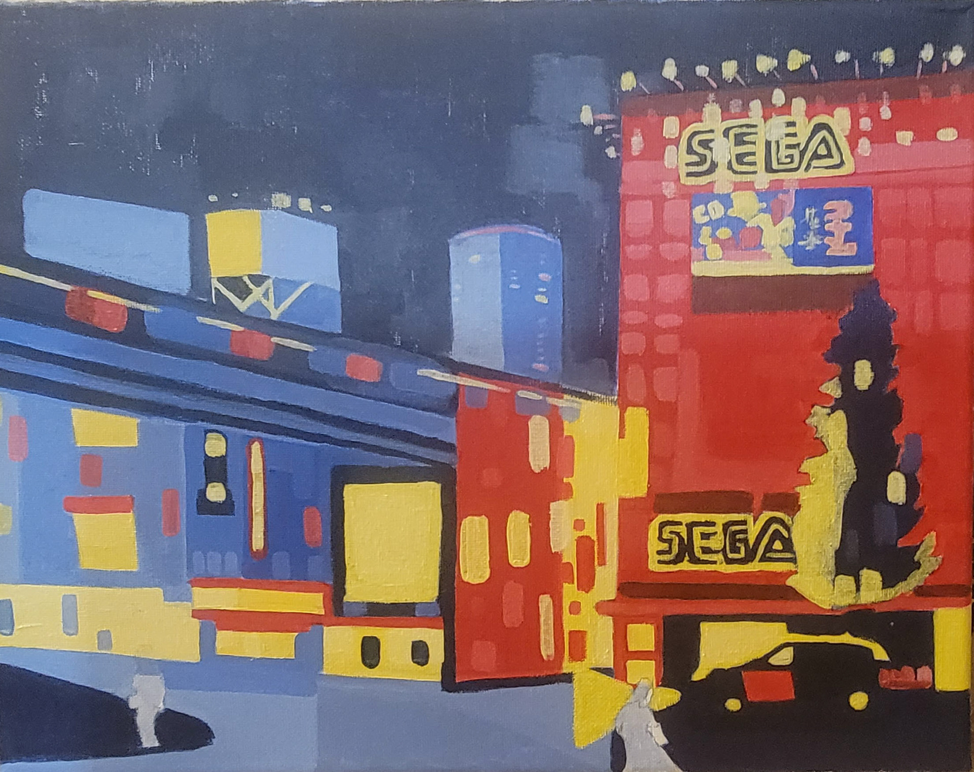
Revision 1: Here I took a completely different approach with the piece. I limited my color palette using the primaries R,Y,B and made simple shapes that fill the landscape. I was inspired from my History of Modern art class when we studied impressionist works like George Seurat and later, Piet Mondrian’s composition’s of Red, Blue and Yellow. The colors are not mixing in this piece to represent separation; I wanted them to be isolated from each other in a sense. With this series, I wanted to inject a theme of isolation into it.


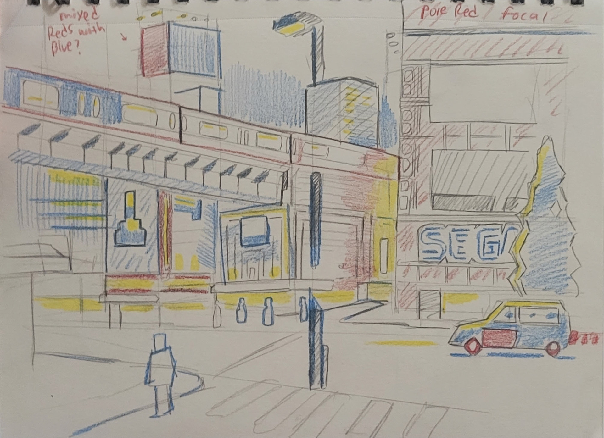
Revision 2: This time I removed the Sega logo off the Sega Arcade tower and borrowed some elements from a TV like the color bar test screen and television fuzz. I used this to further push that idea of isolation and disconnect. The Red rectangle is a representation of the defunct Sega Tower/self portrait. The rectangle is separated from the landscape towards the left-hand side of the landscape.
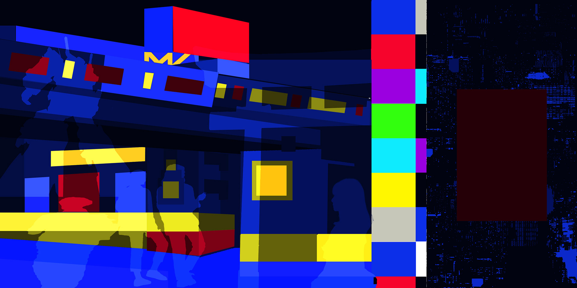
Revision 3: My third attempt had me jump onto a digital platform. I used mainly Photoshop to get this one done. I made several shapes on that platform and I would skew, stretch, resize and create several layers to get this finished product. In here, I placed several layers including people, the Gundam I saw in Odaiba and Meiji Shrine gate in Shibuya. These are just representations of my memories there. Again the rectangle is isolated to the right to comment on the topic of isolation.
Revision 4: essentially, using Adobe Premier, I took the previous revision and added some music Hoshi To Bokura To from the Persona 5 game soundtrack and also some animations to it. It was one of my favorite iterations of the series.
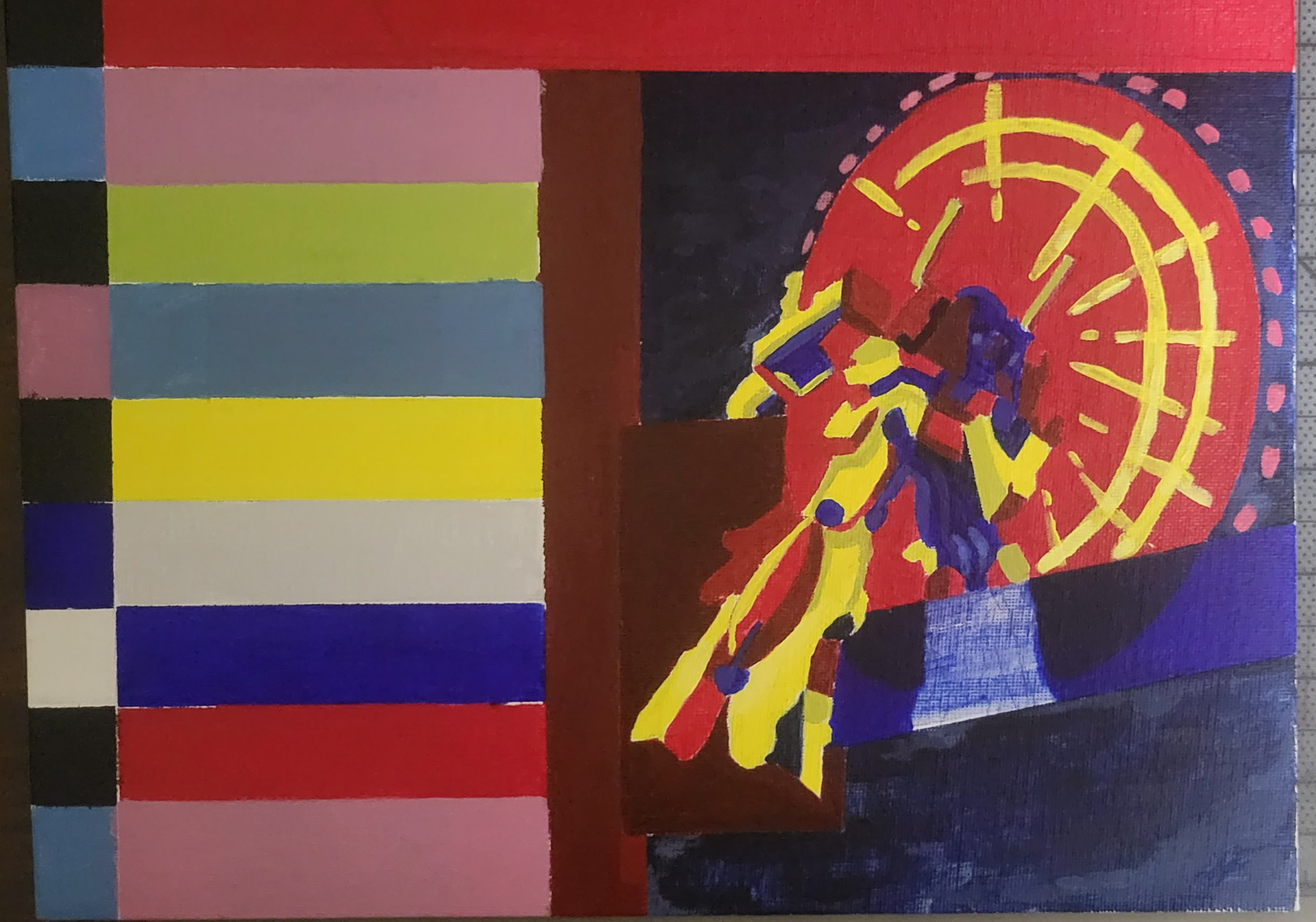
Okay, so I think these next two are where I struggled to find my place with the revisions. With this one, I jumped back to painting- I added those landmarks like the Gundam and Ferris wheel to this one. I felt with painting using acrylics added a layer that I was not able to get switching to digital. It was missing the feel of texture in my opinion, so that is why I jumped back after sketching digitally. I kind of lost my direction with this one and focused more on creating something based on aesthetic instead of that message I was going for, which was isolation.
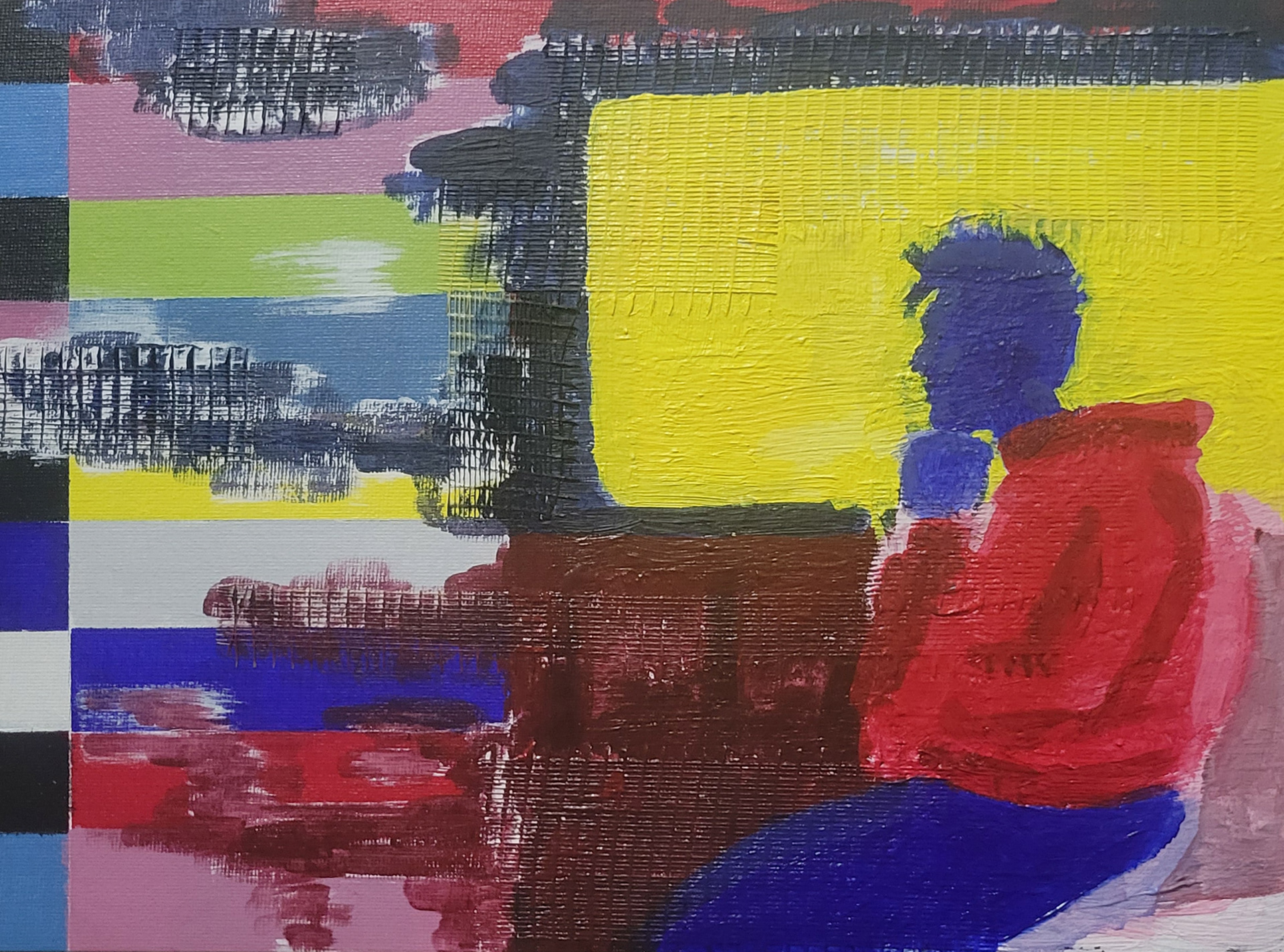
There was some growing pains to get past with this revision. I think this is where I got a bit frustrated with myself haha. I generally liked where I was going, but I was not really setting myself up for success because I was missing some proper reference photos to work from. This is supposed to be a subway scene with me as the figure. As I worked on this, I felt that I was not too happy getting rid of the more abstract representation of myself (rectangle). As I looked at it more, I felt it was unnecessary to place myself in and to me, did not really add another layer to it and was too obvious I guess. I wanted something more subtle in getting the message across. I did enjoy using drywall tape to get my textures here. With gesso, I gessoed over the last piece with the Gundam and Ferris Wheel and made this. It is unfinished, but I wanted to show the process and where I was at at this point.
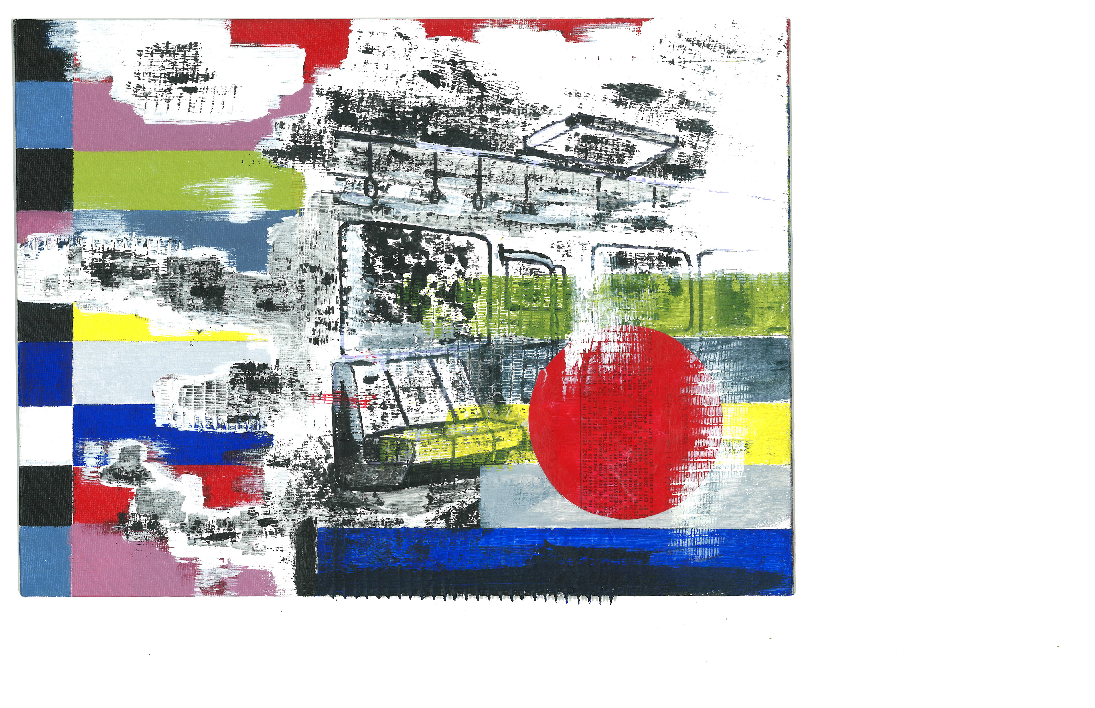
Finally, the final revision! As you can see, this is completely different from what it was before haha. I got a little loose with the gesso and the dry wall tape. I painted a desolate subway scene that breaks through the left-hand side of the canvas. It is a bit more texture heavy, which I am proud of and a lot of the textures where thanks to the dry-wall tape. Essentially I just painted over the tape using my acrylic paint. I also embedded a circular tag that I painted over and repurposed from I package I received. I was influenced by Chris Ashworth’s Instagram page and how he used miscellaneous materials to create his art. I wanted the text to read downward to drag the eye towards the color bars to create eye movement and it is circular shaped and red to represent the Japanese flag. I scanned this piece and when cropping on Photoshop, I enjoyed having negative space surrounding the piece. I think it adds to the isolation idea that I was going for.