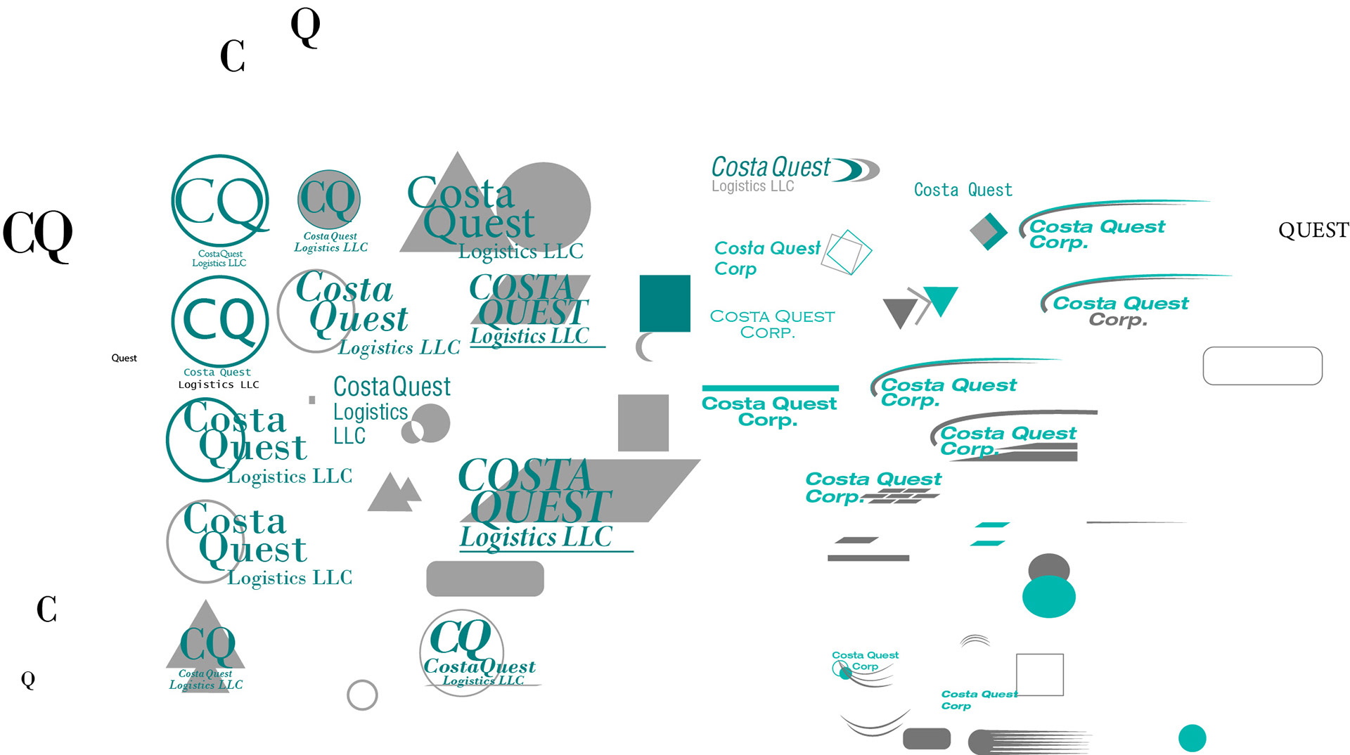
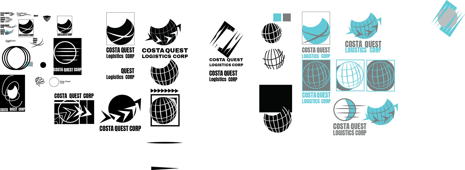
Here is the process for coming up with the logo design for the company. It is a logistics company, so some of the key ideas that started to trickle to form the logo were movement with the stroke marks and arrows ,then a universal connection that I wanted to represent with the sphere-like object.
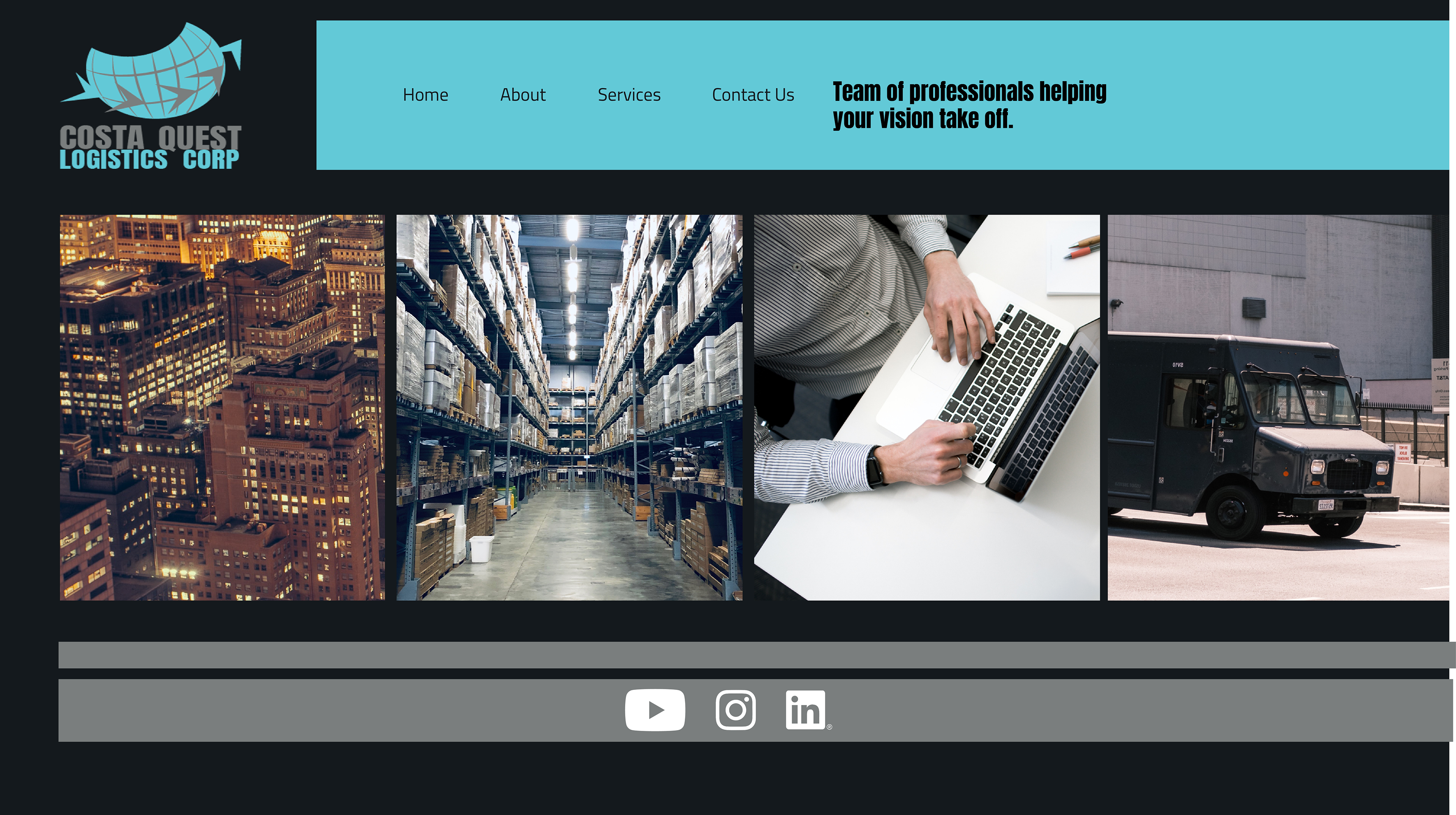
Here is the landing page mockup. The idea with the images is to cover the different aspects of a logistics company since the term is so broad and covers so many fields.
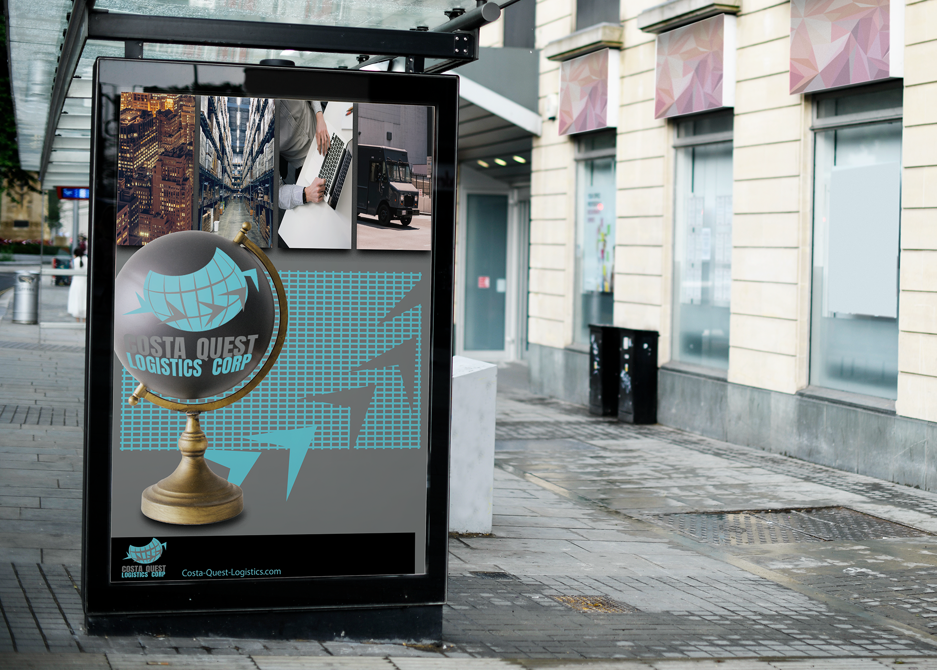
Here's a kiosk ad representing the company. There is a desk globe to emphasize that universal aspect the company has and their versatility.
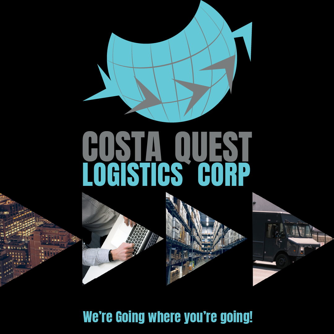
Here is an Instagram mockup for the company. Again we have the arrows symbolizing motion and different stages of the process.